

NewThing Widgets Pro
AppsLab Co.
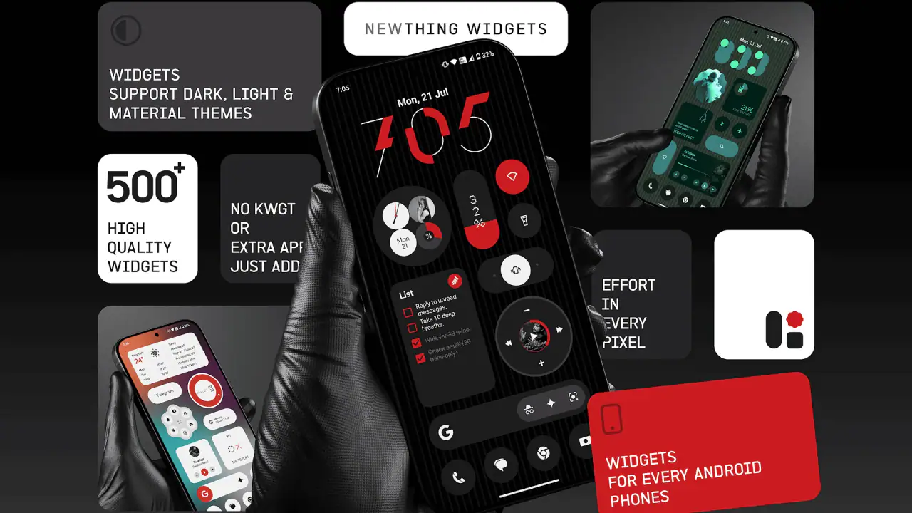
I spent time with NewThing Widgets Pro as a personalization app for Android, and my first impression was that it is aimed at people who want a very particular visual language rather than a completely new home-screen system. Its collection takes inspiration from Nothing-style design: restrained colors, technical-looking typography, clean spacing, and widgets that are meant to feel like part of the wallpaper instead of bright blocks placed on top of it. That makes the app easy to understand, but not automatically easy to use. The real question is whether the widget fits your launcher, wallpaper, and daily habits without creating more fiddling than the visual improvement is worth.
AppsLab Co. has built a catalog with more than 500 widget designs, and that breadth is both its strongest attraction and its first source of friction. I could imagine quickly finding a clock, date, battery, or information panel that suits a monochrome home screen, yet a large collection also means that choosing the right item can take longer than expected. The app is available for Everyone, runs on Android 12 or later, and its current version is 2.6. It is a paid app at $1.99, with additional in-app items ranging from $1.99 to $9.49, so I would approach it as a visual customization purchase rather than a basic free utility.
Where the setup usually gets stuck
The app is not the same thing as the home-screen editor
The most important thing to understand is that a widget app and a launcher do different jobs. NewThing Widgets Pro supplies designs and configuration choices, but the final placement still depends on the Android home screen you use. If you are expecting the app to rearrange your entire layout automatically, disappointment can arrive before you have even tried the first widget. I found it more useful to think of the app as a design library: choose an element inside it, then place and adjust that element through the normal Android widget workflow.
This distinction also explains why two phones can produce different results with the same widget. A launcher may offer different grid sizes, resizing handles, padding, or ways to remove the border around a widget. A widget that looks balanced on one grid can feel cramped on another. That is not necessarily a design failure. It is a reminder to judge the result after placement, not only from the preview inside the app.
Choosing a widget before choosing a layout
My practical advice is to decide what role the widget needs to play before browsing the full collection. A small clock can occupy a quiet corner, while a larger information panel may become the visual anchor of the page. If you select several attractive designs first and only then try to fit them together, you can end up with a home screen that looks busy despite every individual widget being well designed.
Related News

Why WhatsApp Messenger Still Makes Everyday Communication Feel Easy

Jurassic World: The Game Is the Better Dino Tycoon for Strategic Players

Threads in Real Life: Who Should Join, Lurk, or Leave

How SHEIN Turned Shopping Into an Endless Content Feed

How to Make Fortnite Feel Smarter on Mobile

Should You Switch to Microsoft Outlook on Mobile?
I would begin with one prominent element and leave empty space around it. Nothing-inspired styling generally benefits from breathing room, and squeezing several narrow widgets beside one another can make the typography harder to read. Once the first item feels comfortable, add a second only if it serves a different purpose. This is one of the less obvious trade-offs of a large widget pack: having many matching designs does not mean that using many at once will create a better layout.
Why a widget may appear missing
When a newly selected widget does not appear on the home screen, I would first repeat the ordinary Android placement process rather than assuming the app failed. Open the home-screen widget picker, locate the relevant entry, press and hold it, and drag it onto an available area. On some launchers, a tap opens a list or preview instead of placing anything immediately, so the interaction can feel inconsistent even though the widget is available.
Space is another easy detail to overlook. A page may look empty but still lack the exact rectangular area required by the selected widget. Moving an existing icon temporarily, trying another home-screen page, or placing the widget before rebuilding the rest of the layout can reveal whether the problem is simply available space. I prefer this test because it separates a placement issue from a design or compatibility issue without changing many settings at once.
Gallery
Setup checks that save time
Start with the simplest possible test
For a first run, I would not begin by creating a carefully themed page. Place one small widget, leave the default wallpaper in place, and check whether it renders correctly and remains readable. This gives you a clean baseline. If the first result is already correct, you can then experiment with wallpaper contrast, grid size, and a more ambitious arrangement. If it is not correct, you know the issue appeared before your personal styling choices complicated the picture.
This approach is especially useful for anyone moving from a different Android phone. The operating system requirement is Android 12 or later, but meeting that requirement does not make every launcher layout identical. A device can be technically compatible while still presenting different resizing behavior or different widget spacing. Testing one item first is faster than building an entire page and then trying to identify which part caused the awkward result.
Check readability, not only appearance
The visual style is intentionally controlled, so it can look excellent in a preview and become less practical on a real wallpaper. I would check the widget in daylight, in a dim room, and after placing the icons you use most often. Thin lettering and low-contrast elements may suit a dark, simple background but lose clarity over a photograph or a highly detailed image. A design that looks sophisticated is not useful if you have to stare at it to read the time or status information.
There is also a useful distinction between decorative and functional placement. A large widget near the center of the first page can make the phone feel coherent, but it may push frequently used icons farther away. I prefer putting information I check often within an easy thumb reach and using the more decorative pieces on a secondary page. That arrangement preserves the visual identity without allowing the theme to interfere with ordinary tasks.
Keep the first configuration deliberately modest
NewThing Widgets Pro is most convincing when the design has room to work. I would resist filling every open area simply because the collection offers a matching option. One clock, one date element, and a carefully chosen information widget may be enough. If you want a denser screen, add items gradually and remove anything that repeats information already visible elsewhere.
This is also where the cost deserves attention. The base price is $1.99, and some additional items are priced from $1.99 to $9.49 each. That does not make the purchase unreasonable, but it changes how I would browse. I would identify the visual style I actually want before buying extras, rather than treating the large catalog as a reason to collect every design. The app works better as a focused customization tool than as an endless shopping exercise.
Use the current version as a sensible starting point
The current version is 2.6, and I would make sure the app is updated before troubleshooting a problem that might already have a routine fix. After an update, I would test an existing widget and then place a new one, because those two checks answer different questions. An existing item tells you whether the current layout still behaves normally; a new placement tells you whether the selection and setup path are working.
I would avoid changing several variables at the same time. Do not switch launchers, replace the wallpaper, resize the widget, and rebuild the icon arrangement in one attempt. Make one change, look at the result, and continue from there. That habit is simple, but it is particularly valuable with personalization apps because visual problems can come from the interaction between the app and the rest of the home screen.
Recovering a workflow after something goes wrong
When a widget disappears after editing
If a widget vanishes after resizing or rearranging the page, I would first check whether it was accidentally removed or moved to another home-screen panel. Android editing gestures can be easy to misread, especially when a widget has small handles or sits close to an icon. Returning to the widget picker and placing the same design again is a useful recovery step, but I would do it only after checking the neighboring pages so I do not create duplicates.
If the widget returns but looks different, compare its size and position with the original arrangement. Resizing can alter the balance of the design, and a widget that was intended to span a wider area may become harder to read when compressed. In that situation, I would restore the previous dimensions rather than immediately blaming the artwork. The better-looking choice is not always the smallest one, particularly for typography-led designs.
When the page becomes visually crowded
A common workflow problem is not a technical failure at all: the page gradually becomes too busy. I noticed that matching widgets encourage experimentation because they appear to belong together. The result can be a collection of clocks, dates, and status details competing for attention. My recovery method is to remove the least useful item, then assess the page from a normal distance instead of judging each widget separately.
I also recommend taking a screenshot before major changes. This is not a NewThing-specific feature; it is simply a practical way to preserve a layout you like. If a new arrangement does not work, you have a visual reference for restoring the spacing, relative sizes, and empty areas. The screenshot is especially helpful when you are testing several pages and no longer remember which version felt most natural during daily use.
When the widget is present but does not feel right
Sometimes the setup is successful and the result is still disappointing. The widget may be too small for its type, the text may blend into the wallpaper, or the page may feel unbalanced because the launcher grid does not match the design. In that case, I would try a different size or a less demanding design before abandoning the whole app. The collection is broad enough that one unsuitable choice should not define the entire experience.
There is a useful workflow distinction here: troubleshoot function first, then style. Confirm that the widget can be placed and read. Only after that should you fine-tune its position, combine it with icons, or change the wallpaper. This prevents you from mistaking a poor aesthetic pairing for a broken widget and gives you a clearer idea of what NewThing Widgets Pro can actually improve.
When the app is not the cause
Launcher behavior can change the result
If the widget cannot be resized, has unexpected padding, or refuses to sit where you want it, the launcher is a serious suspect. Different launchers interpret the same widget dimensions in different ways, and some impose their own spacing around every widget. I would test the item on a clean page and compare its behavior with another ordinary widget already on the phone. If both show similar spacing or resizing limitations, the launcher is probably shaping the result.
This is one reason I would not recommend the app equally to everyone. If your priority is precise pixel-level control over every part of the home screen, a more configurable launcher or a specialized design system may suit you better. NewThing Widgets Pro is stronger when you want a ready-made visual language without designing every element from scratch.
Wallpaper and contrast matter more than expected
A widget can be perfectly placed and still appear broken because its colors do not separate from the background. Before reinstalling anything, switch temporarily to a plain wallpaper and check the same design. If the text becomes clear, the app is doing its job and the original wallpaper is the problem. You can then choose a darker, lighter, or less detailed background while keeping the widget you wanted.
This test is particularly important for the app's restrained aesthetic. Bright, colorful wallpapers may be attractive on their own, but they can undermine the quiet visual hierarchy that makes these widgets appealing. I would choose the wallpaper after selecting the main widget, not before. That reverses the usual customization order and often produces a more coherent result.
System restrictions can affect reliability
Android may manage background activity differently from one device to another. If a widget does not refresh as expected, I would check the phone's own battery and background-activity settings before concluding that the design pack is unreliable. The exact menus vary by manufacturer, so the safest approach is to look for the app in the device's battery or app-management area and review whether the system is restricting it.
I would make changes carefully and only when the behavior genuinely affects your use. Relaxing every battery restriction can have consequences for overall phone endurance, so it is not a sensible first response to a cosmetic issue. For a clock or static information panel, a minor refresh delay may be less important than keeping the phone efficient. This is a good example of a trade-off that the store summary cannot show: personalization should not automatically take priority over the device's normal resource management.
Know when to stop troubleshooting
If a basic placement test, a clean page, and a plain wallpaper all produce the same problem, I would stop repeatedly rebuilding the home screen. At that point, the sensible next step is to use the app's available support route or check for a newer app version, rather than trying random system changes. Repeatedly clearing settings or changing launchers can create more work and may erase a layout you wanted to keep.
The same restraint applies to compatibility expectations. The app is designed for Android 12 and later, but that does not promise identical behavior across every manufacturer interface. If your phone's launcher handles third-party widgets unusually, another widget pack with a different design approach may not solve the underlying issue either. The better alternative may be a launcher with stronger widget controls, especially if layout precision matters more to you than the Nothing-inspired appearance.
How it fits everyday use
A realistic morning setup
Imagine checking your phone first thing in the morning. You want the time and date immediately visible, but you do not want a page covered in colorful panels. I think this is where NewThing Widgets Pro makes the most sense. A restrained clock near the top, a small date element below it, and a clear row of frequently used apps can create a calm first page. The design supports quick checking without turning the home screen into a dashboard.
The key is to keep the practical information close to the area you naturally look at. If the widget is visually striking but placed where your hand rarely reaches, you may admire it for a day and then stop using it. I would optimize for the first five seconds after unlocking the phone: can you read what matters, tap the apps you need, and move on? If yes, the theme is helping rather than becoming another task.
A focused work or study page
I can also see value in using a separate page for work or study. A simple information widget can provide a visual break from the more crowded personal page, while a small set of essential apps keeps the layout deliberate. The advantage is not that the app replaces a productivity system; it does not. Its contribution is reducing visual noise and giving a specific context its own appearance.
For this use, I would avoid adding designs that display information you do not actually check. A widget should earn its space. If an element looks good but never changes how you use the phone, it belongs in the decorative category, and decorative elements are best kept limited. That judgment helps prevent the large selection from turning a focused page into a showcase of everything available.
Who will appreciate the collection most
The app is a strong match for people who already like monochrome interfaces, Nothing-inspired visuals, and carefully spaced home screens. It is also useful for someone who wants a consistent look without manually drawing widgets or learning a complex design tool. The ready-made approach lowers the creative barrier: you can concentrate on choosing, placing, and combining rather than building every component.
I would be more cautious if you prefer colorful, information-dense widgets or expect deep control over every data source and interaction. NewThing Widgets Pro is primarily a visual personalization purchase. If your main goal is advanced automation, a highly customized dashboard, or a widget that behaves like a full productivity application, a dedicated tool in that category will probably be a better fit.
My practical verdict
NewThing Widgets Pro has a clear identity, and that is its greatest strength. The collection is not trying to be visually neutral; it is built around a specific Nothing-inspired mood. When the wallpaper, launcher grid, and widget size cooperate, the result can make an ordinary Android home screen feel carefully designed with relatively little effort. Its average rating is 4.5 from around 7.3 thousand ratings, and more than 100 thousand installs suggest that the approach has found an audience.
My recommendation comes with a condition: treat the app as a starting point for a layout, not as a magic switch that transforms the phone. Begin with one widget, test it on a clean page, check readability against the wallpaper, and add other elements only when they improve your routine. If something looks wrong, separate placement, launcher behavior, contrast, and system restrictions before changing everything at once. Those checks solve more real-world frustration than endless browsing through designs.
The price is reasonable for someone who already wants this particular aesthetic, but the additional item costs make selective browsing important. I would buy it for a focused visual refresh, especially if I wanted a calm clock-and-date arrangement or a themed secondary page. I would skip it if I were looking for a universal widget toolkit, extensive automation, or a launcher replacement.
My bottom line: choose it for the look, test it patiently with your launcher, and keep the layout restrained. In my experience, that combination lets the collection show its best side while avoiding the most common setup traps. For the right Android user, it is an easy way to give the home screen a distinctive character; for someone who values maximum control or colorful utility above appearance, another personalization approach will be more practical.
FAQs for NewThing Widgets Pro
What is NewThing Widgets Pro, and what can I use it for?
NewThing Widgets Pro is a customizable widget app designed to help you personalize your Android or iOS home screen with useful information and shortcuts. Depending on the available widget collection, you may be able to display items such as clocks, calendars, weather, battery details, notes, or app shortcuts. Its main appeal is combining practical at-a-glance information with a more personalized home-screen appearance.
Is NewThing Widgets Pro compatible with my device?
Compatibility depends on your device model, operating system version, and the features supported by the platform. Before downloading, check the app-store listing for the latest Android or iOS requirements. Some widgets may work differently across platforms because Android and iOS provide different levels of home-screen customization. If you use an older phone or tablet, certain designs, interactive functions, or update options may not be available.
Does NewThing Widgets Pro require a subscription or include in-app purchases?
NewThing Widgets Pro may offer a paid upgrade, one-time purchase, subscription, or additional in-app content, depending on the current store version and region. The free version, if available, may include a limited selection of widgets or customization tools. Review the pricing section carefully before confirming a purchase, especially if a trial period is offered, since trials can automatically renew unless canceled through your device’s subscription settings.
How do I add and customize a NewThing Widgets Pro widget?
After installing the app, open it first and review the available widget styles and settings. Then use your device’s home-screen editing process to add the desired widget, select its size, and choose the design or information you want displayed. Customization options can vary by widget, but may include colors, fonts, transparency, layouts, refresh behavior, and data sources. Some changes may require saving the design inside the app before they appear.
Does NewThing Widgets Pro affect battery life, privacy, or device performance?
Like most widget applications, NewThing Widgets Pro may use some battery and system resources, particularly when widgets refresh frequently or rely on weather, location, calendar, or other live data. Check the permissions requested during setup and grant only those you are comfortable providing. Reviewing the app’s privacy policy is also recommended, especially if widgets access personal information. Reducing refresh frequency or removing unused widgets can help limit resource usage.
Pros
- Wide selection of customizable widgets for different home-screen styles.
- Pro tools allow more precise control over layouts
- colors
- and widget content.
- Useful for creating a consistent visual theme across the device.
- Widgets can provide quick access to information without opening full apps.
- Suitable for users who enjoy personalizing their Android home screen.
Cons
- Some advanced customization options may require extra setup time.
- Widget performance can vary depending on the device and Android version.
- Large or frequently updating widgets may affect battery usage.
- The interface may feel overwhelming for users seeking simple presets.
- Compatibility with certain launchers or system layouts may be limited.


